Mind Coffee UI/UX Design
Coffee Meets Mindfulness
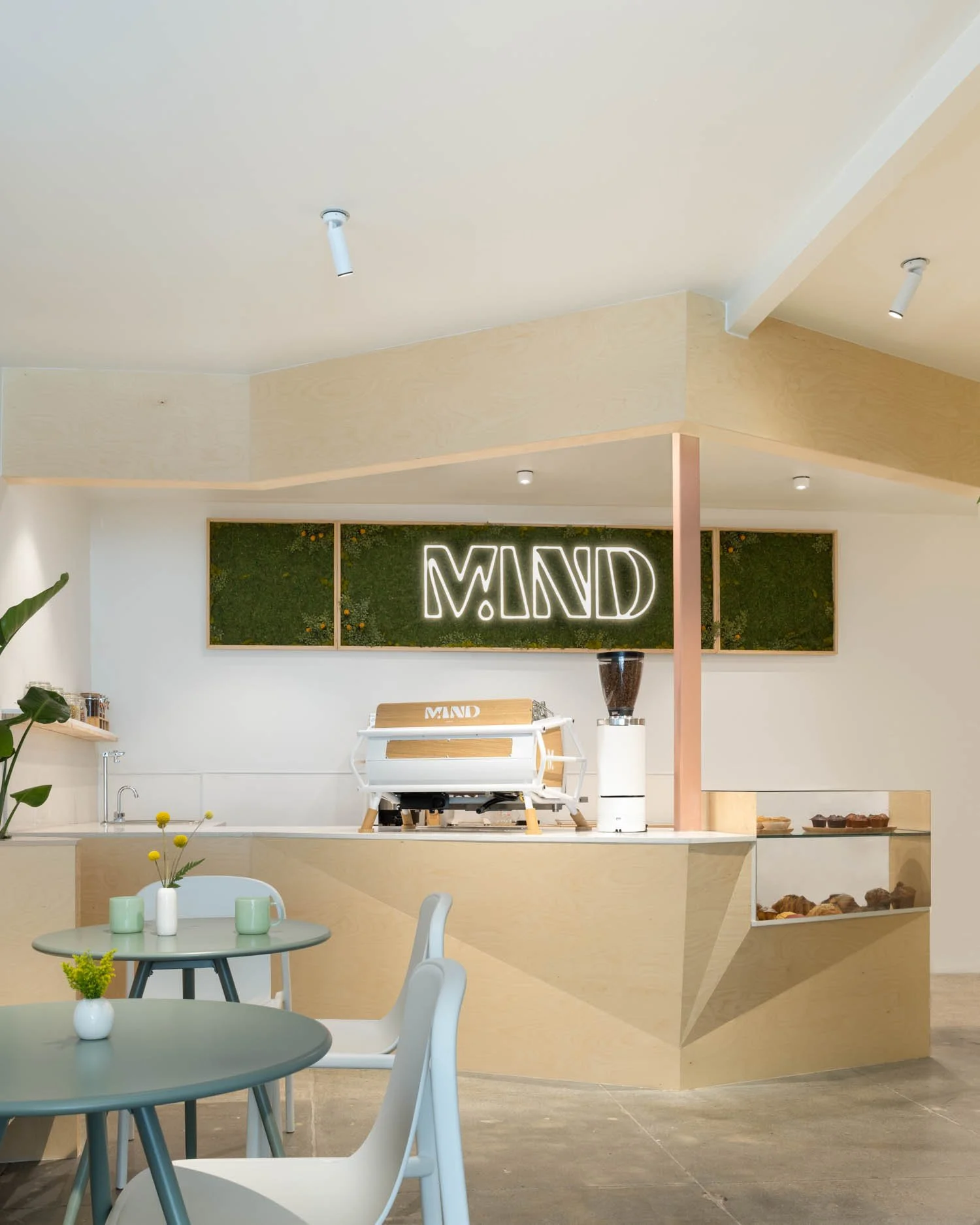
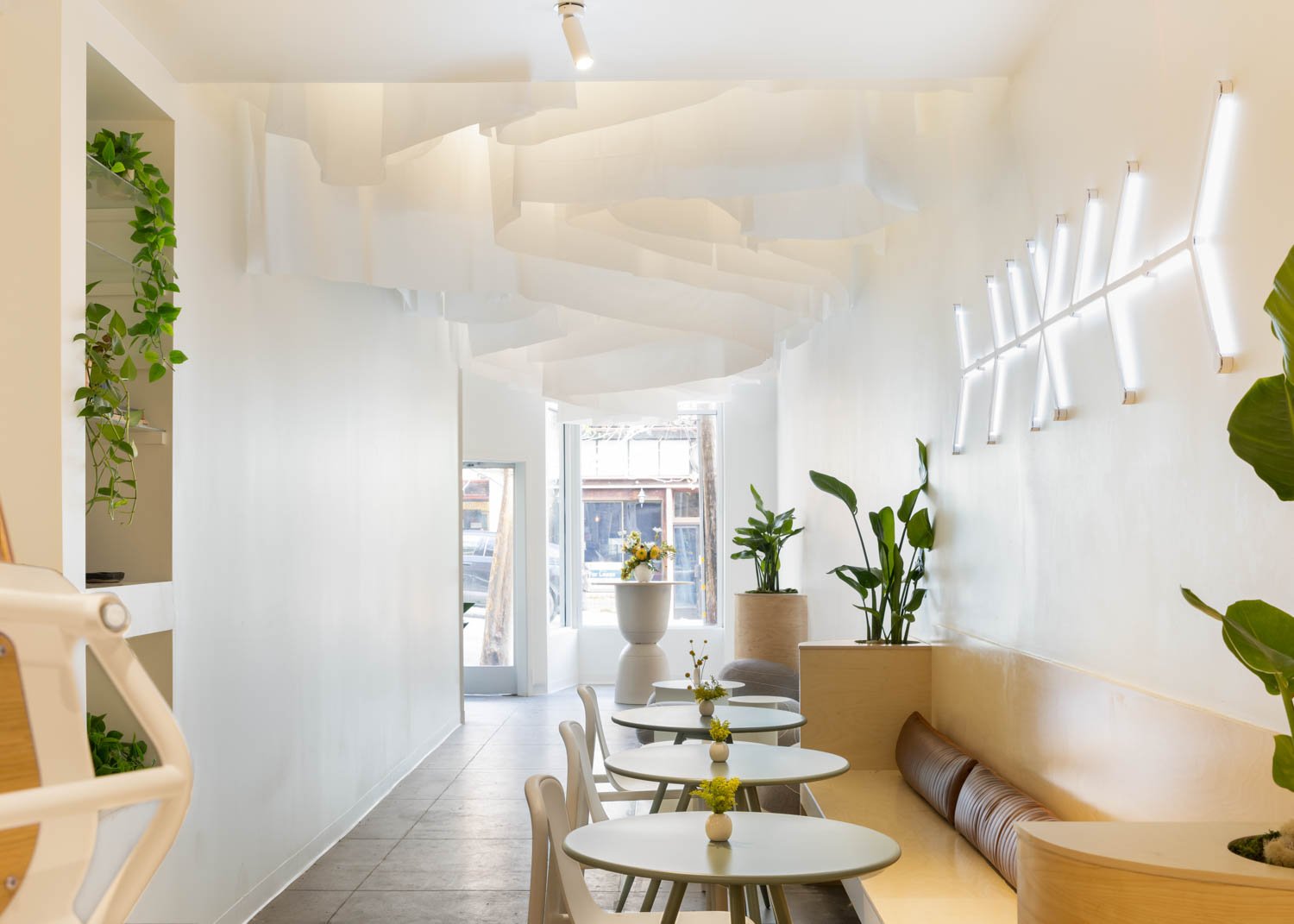
Mind Coffee is a local and beloved coffee shop 1 block away from the UC Berkeley campus. Mental wellness is a core part of their brand. The owner noticed her customers always seemed stressed in her cafe, and wanted to support them in a way that integrates mental health support with her coffee experience. She wished to do so utilizing a Mind Coffee mobile app.
Primary Goals
Gauge community interest
Explore possible features
Design features
Establish brand identity
Design and iterate through features
Culminate in a High-Fidelity Design
Problem and Context
How might we supply Mind Coffee customers with access to mental health support?
Users:
Berkeley students, ages 18-30 who regularly consume coffee
Local Berkeley residents aged 25-50 who are customers of Mind Coffee
Stakeholders:
Viviana: Owner of cafe
UX@Berkeley: Club our team was contracted through
Why Does it matter?
The University of California Berkeley ranks within the top 15 most unhappiest campuses in the United States. Access to mental health resources is convoluted, and in some cases, expensive. This app could act as a safe haven for Mind Coffee customers, and hopefully help those feel safe in times of mental health distress.
Research
Research
Methods used:
Competitive Analysis
Interviews
User surveys
User Personas
Competitive Analysis
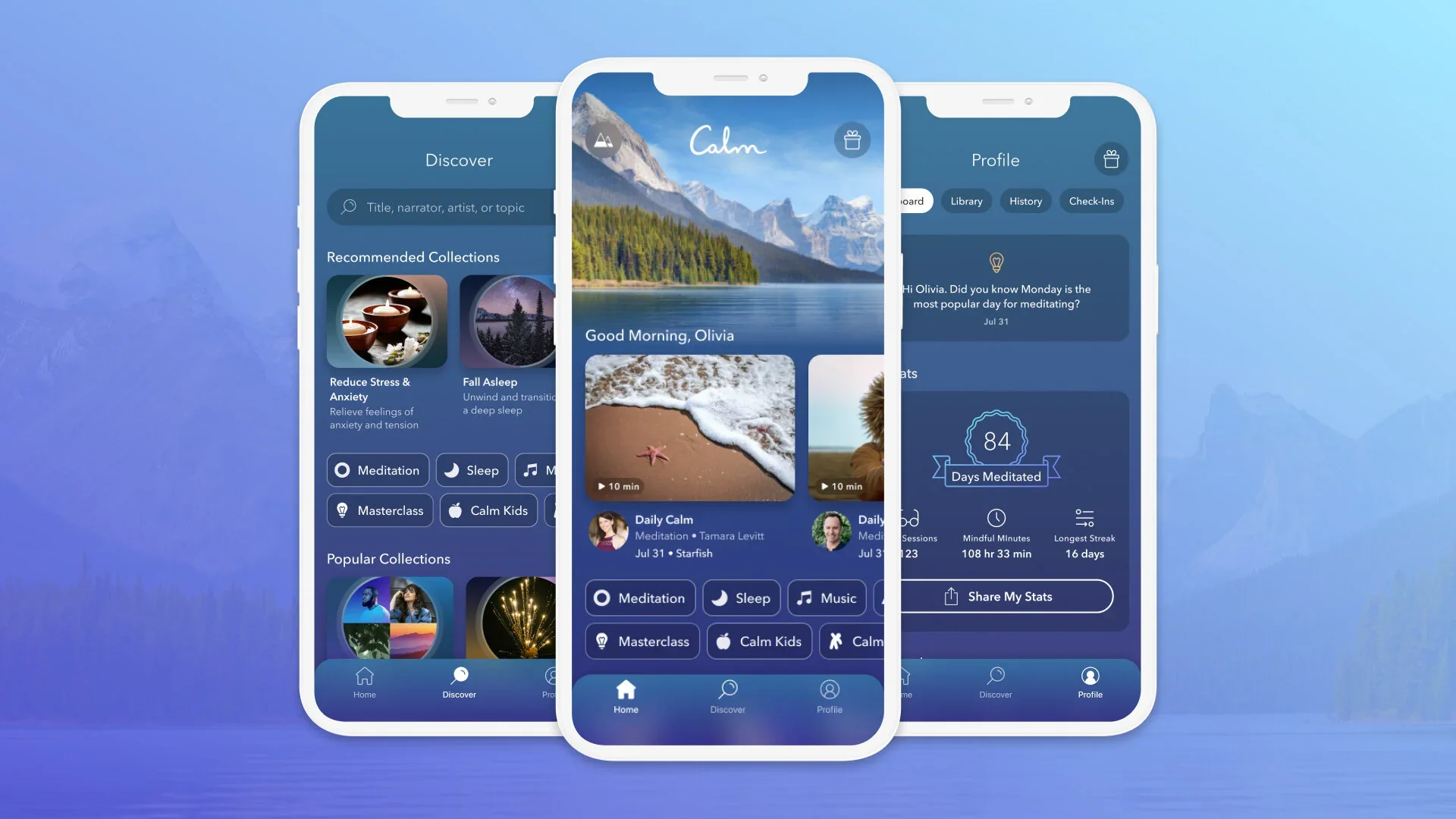
Headspace

Key Insights
Visual: Bright colors, cute pictures & animations
Information Architecture: hard to locate key features, cluttered task bar
Features: yoga, running, meditation, sleep, direct therapy, and AI companion. Bloated?
The feature with the most interest is a way for customers to gain treats in store while using the app
Guided meditations were of high interest
People found that connecting with friends was one of their greatest support
Inconsistency and inconvenience are pain-points in peoples meditation practice
Dislike of cooperate nature of Headspace
Dislike of clunky flow of Calm
Headspace has a clunky information architecture
Simplicity is important for user experience of competitors
Interview Quotes:
“I will only drink coffee in times where I need caffeine… [coffee] does not make me anxious”
“What bothers me the most about my mindfulness practice…inconsistency, lack of resources, easy to forget”
Bloom
Key Insights
Visual: Dark colors, nature images, soothing, less “sleak”
Information Architecture: Simplistic, minimal task bar, ease of search function
Features: meditation, sleep
“Calm app is clunky…headspace feels too cooperate”

Key Survey Insights
Responses were highly varied when asked “does coffee make you anxious?”
For those who used meditation apps, they preferred “body scan” meditations
General interest in all of our proposed features, with free drinks and gifts having the most
“I practice mindfulness by simply being present with what I am doing…working out, eating, and drinking”
Many qualitative reports of seeking support from friends a loved ones over professionals
90% noted they would benefit from greater access to mental health support
Many reported a lack of resources inhibiting mindfulness practices
For those who do not use mindfulness or any meditation apps, most expressed interest in exploring the concept

Personas
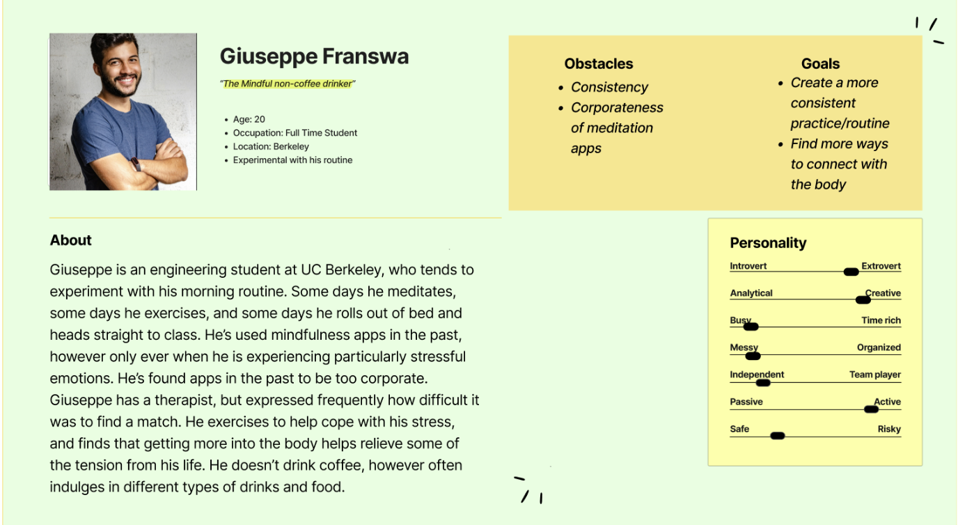


Final Research Insights

Low Fidelity & Wireframe:
Design Process: Low to Mid fidelity

Chosen Color scheme:

Iteration, Faliure, and Adaptation: Mid-Fidelity


Task Bar:
Home
Social
Meditations
Profile
App Launch Interaction:
Login ->
Meditation streak ->
Time until next reward ->
Home ->
Social/Meditations/Profile
Why?:
Color scheme of store
Balances sleek with welcoming
Coffee tones
Avoids cooperate feel of Headspace

Major Issues:
Inconsistent font and color
Inconsistent typography size
lack of consistency with stroke and shadow
incorrect tool bar, too large
information hierarchy not clean
background color doesn’t match the wishes of client
Padding not standardized

Hi Fidelity

Figma Overview

Reflection
Key Screens:
Splash Screen:

Welcome & Streak:

Profile & Friend:

Friends list:

Succseses:
Assured consistency in typography, Font, and Color
Simplistic Navigation
Friend and Profile page for checking in on others
Streak page for tracking days until next reward
Areas of Improvement:
Task bar coloration?
Flesh out friend interactions, friend list
Begin with design systems, then mid-fidelity not vice-versa
This was my first design project within UX@Berkeley, and my first time in the role of project manager. I went in relatively unaware of the standard design process. Initially, I ran into difficulties while trying to coordinate a large team of full time students, but as the weeks went on, I learned how to effectively organize the mind coffee team, coordinating open windows to meet, project timelines, and a shared calendar. By the end of this project, I became fully versed in human centered design, and how to communicate effectively with real world clients & stakeholders. As a team of new designers, we had to start from scratch a few times. We skipped steps when we shouldn’t have, and felt the consequences in our first iterations. If I were to do the same project again today, I would focus more on creating a fully fleshed out design system before diving into the mid and hi-fidelity designs, a lesson which I have taken with me into all future projects. This way, our components would maintain a higher level of consistency across all screens. Our client was pleased with our final iteration, noting it’s consistency with their brand identity and vision.